.png)
Hi I'm Ballesa, the Sr Creative Design Lead here at ServiceUp. 👋
The idea took shape when Kam, ServiceUp’s Head of Marketing, asked whether the brand still reflected who we had become.
The company had grown quickly. The platform had matured. We were working with larger fleets and solving more complex operational challenges than we were even a year ago. The brand still reflected an earlier stage of the company.
So we stepped back.
Rather than treat this as a visual refresh, we approached it as a reset. We revisited the fundamentals: who we serve, how the platform operates at scale, and what makes ServiceUp distinct in a crowded space. Four elements consistently surfaced as our DNA: Motion. Connected. Intelligent. Bold.
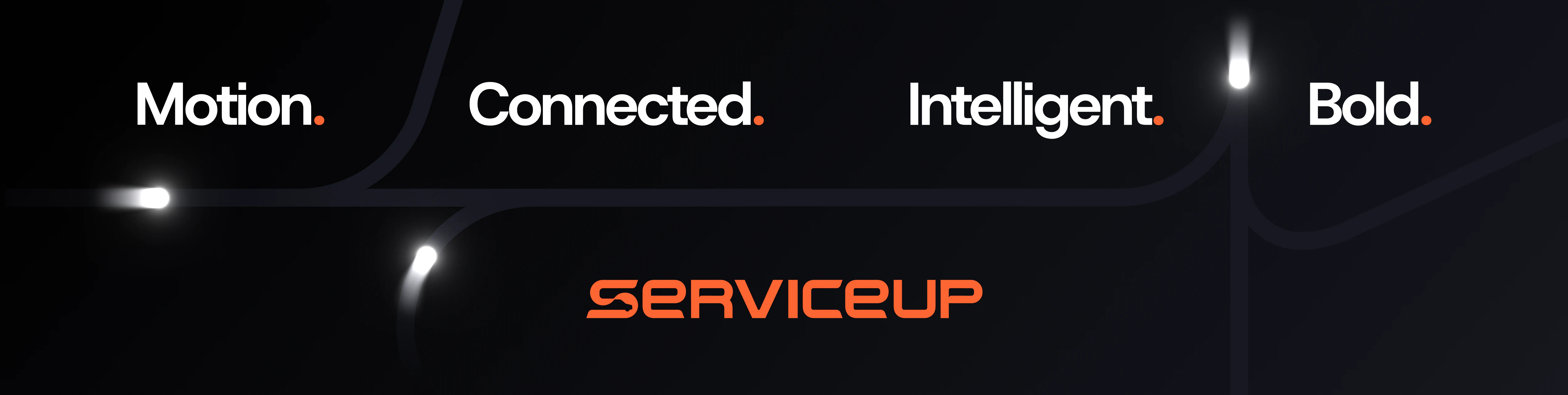
The visual identity was built around those principles.
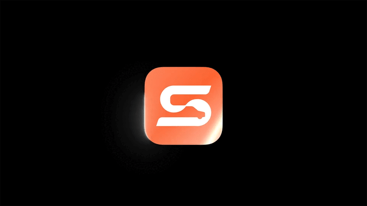
The new icon brings the S and U together into a continuous form. There are no breaks or disconnected pieces. That continuity represents motion and coordination, the way repairs, approvals, data, and shops flow through one system. It also reflects connection, with fleets, shops, and insurers operating within a single platform instead of scattered tools.
The form carries forward energy without feeling aggressive. It is directional and balanced, suggesting movement without relying on literal automotive imagery. We intentionally avoided steering wheels, speedometers, or road graphics. ServiceUp is software first. The symbol needed to feel modern and scalable.
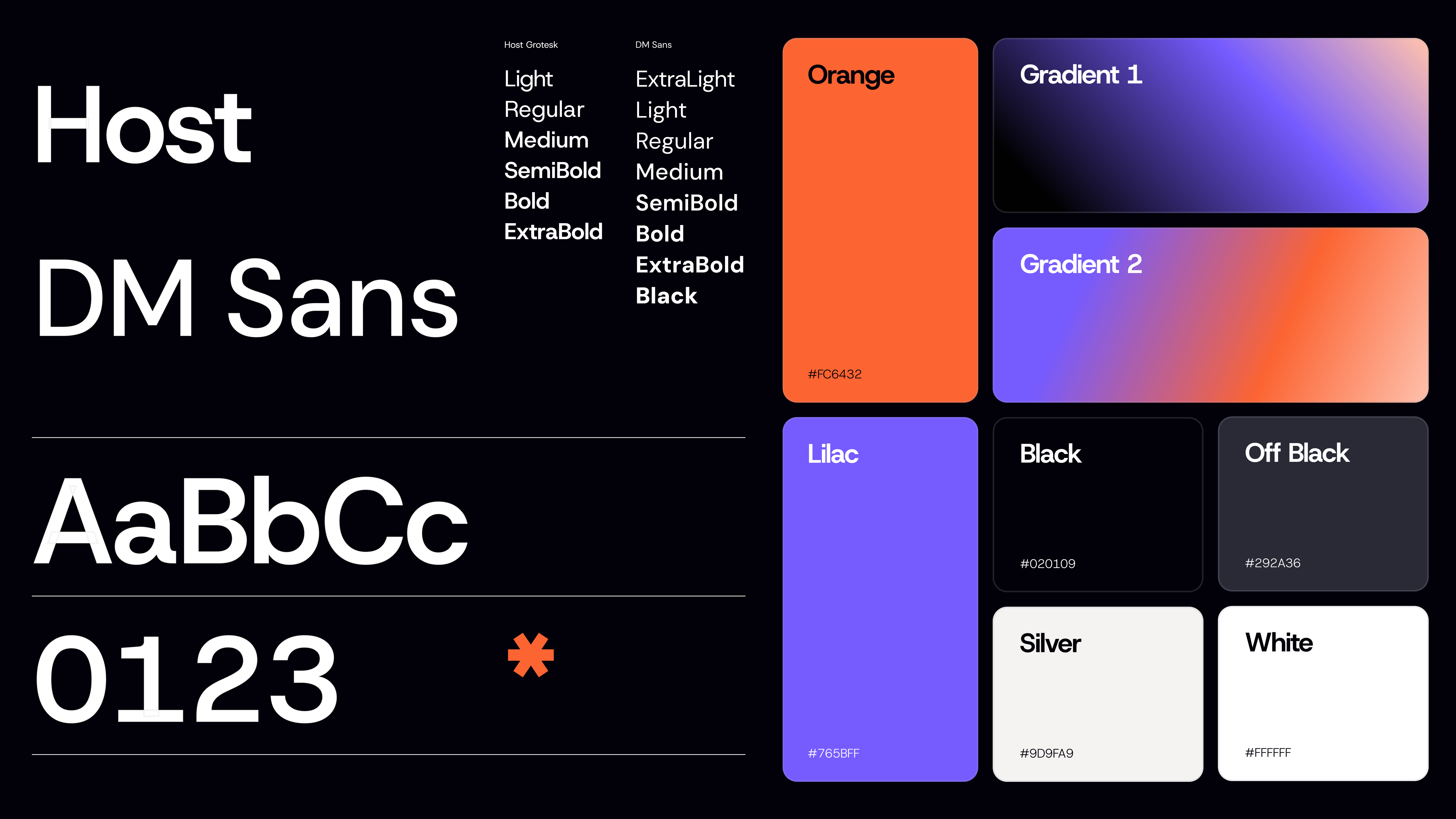
The wordmark was custom-built to express intelligence and confidence.
We wanted letterforms that feel structured and deliberate, with subtle curvature that echoes the motion in the icon. The geometry is clean and stable, reinforcing clarity and trust. At the same time, the weight and spacing give it presence. It does not feel decorative. It feels intentional.
Bold, in this context, means assured. The typography carries that tone across product screens, sales materials, and physical environments.
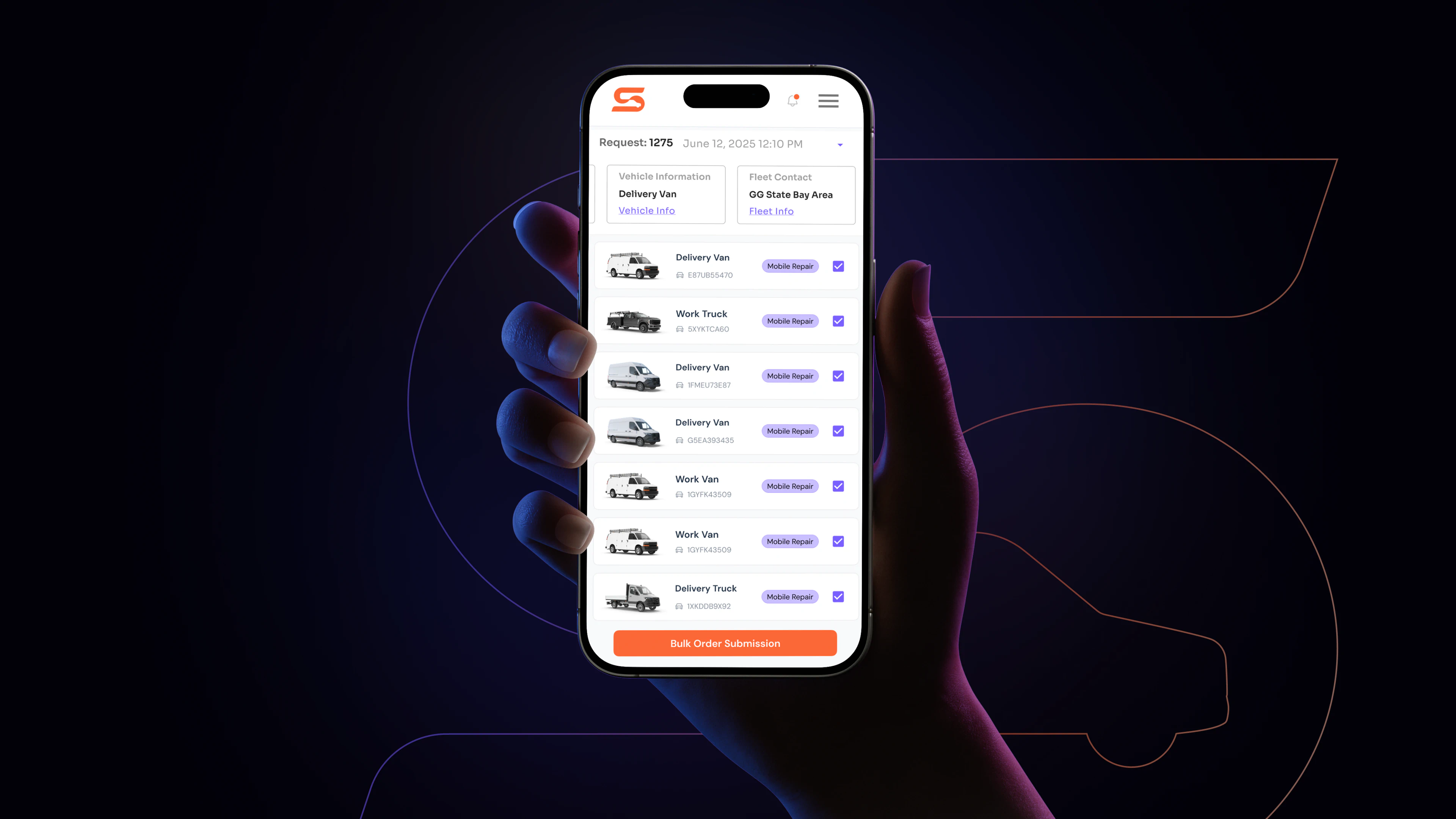
Color and typography were chosen for clarity and contrast so the brand performs in the product just as well as it does in marketing. Every element works together as part of a cohesive system.
Throughout the process, one idea remained central. Fleets care about uptime. They care about vehicles moving and operations running smoothly.
That is where our brand promise, More Road Time, comes from.
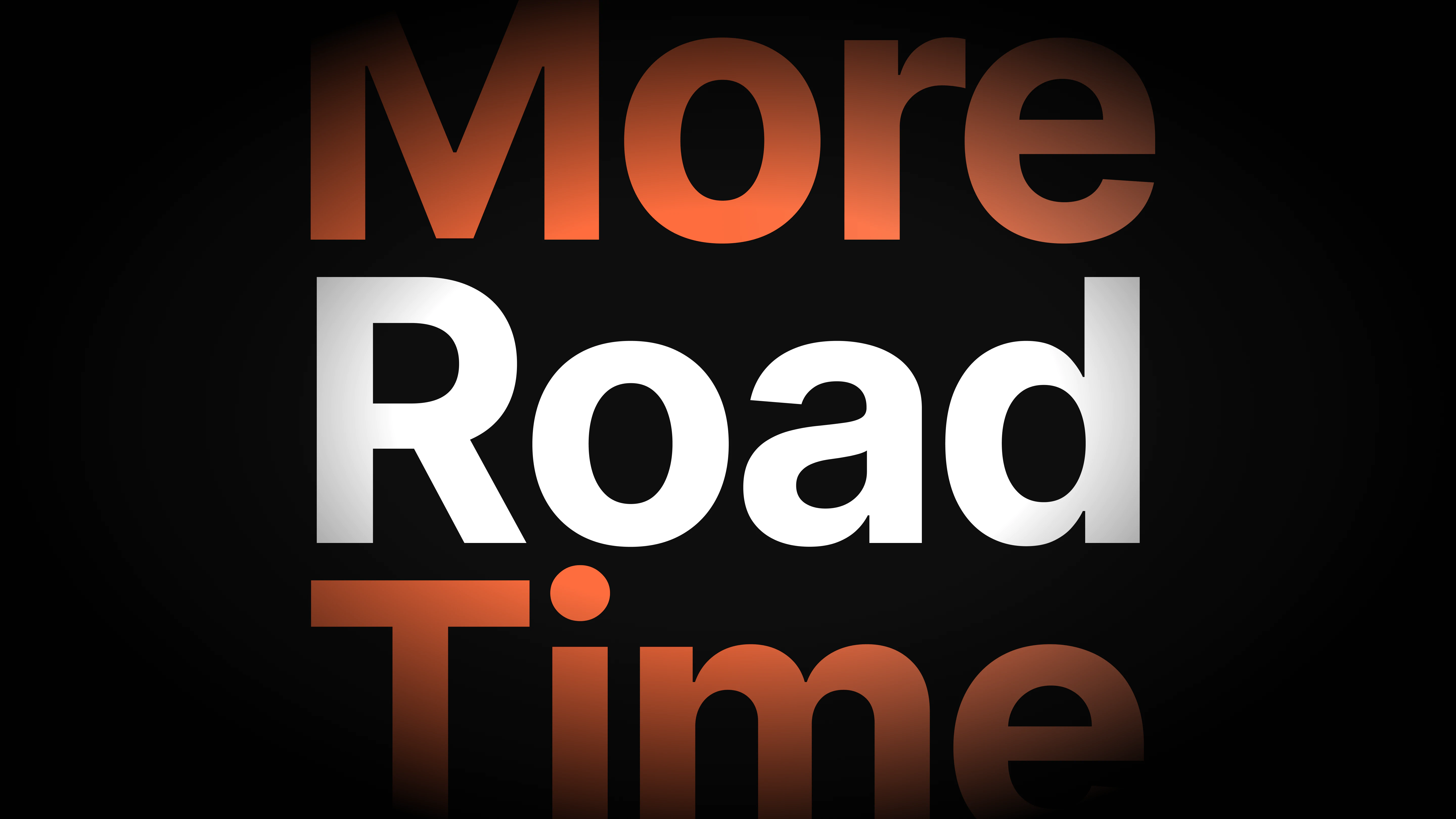
It reflects what the platform enables in practical terms. Less downtime. Faster coordination. Clearer oversight.
This rebrand aligns our visual identity with the company we have become, a connected, intelligent platform built to keep fleets in motion.
Want to chat more about our brand? Hit me on Linkedin.
.png)

.png)